

MAY 2015 - NOV 2015
Avanti’s internal content management application

ABOUT AVANTI
Avanti Learning Centers provides after-school STEM tutoring to 6000+ high school students in 11 states across India. They have 40+ dedicated employees who create high quality content for in-class materials, which is their key value prop.
For their day-to-day jobs, these content creators rely heavily on a custom-built content management application, which was created by an internal product team composed of 4 engineers and a PM.
MY ROLE
In 2015, I joined as their first in-house product designer. As the UX team of one, my primary task was to improve the design of this application. So I took initiative to follow the human-centered design process to
Identify opportunities for improvement
Prioritize changes in collaboration with the PM
Iteratively design solutions while regularly testing with users
IMPACT
The most impactful feature I delivered was the redesign of the navigation. The new design helped reduce the steps to complete key tasks by 40% and was very well received by users. Also, I introduced a user-centered culture in the company, which was carried forward by the PM after I left.
Problems
Using a combination of heuristic analysis (based on Nielsen Norman’s principles) and 10 user interviews, I identified key problems in the existing navigation that made the UX cumbersome (see image below).
The labels in the menu didn’t match the users’ mental model, leading to a frustrating way-finding experience.
The content that was intended to be edited together was split between multiple pages, causing the user to have to frequently go back and forth.
Multiple sections of content was listed in one long-scrolling page, making it extremely hard to find anything quickly.

Solution
DESIGN PROCESS HIGHLIGHTS
Combining the language from users’ existing documents and results from a card sorting exercise with 10 users, I designed the new information architecture.
To resolve the interaction design problems, I explored multiple solutions ranging from mild tweaks to wild blue-sky ideas.
Through rapid testing and iteration, I landed on the idea of creating a single access point for all content in one left-side menu.
DESIGNS SOLUTION SHIPPED

The left side menu is structured using the results from the card sorting exercise.

On clicking a specific menu item, the list of available content shows up in the right. Each content item is displayed in a summary view for quick scan-ability.

The user can hover on the content to view possible actions.
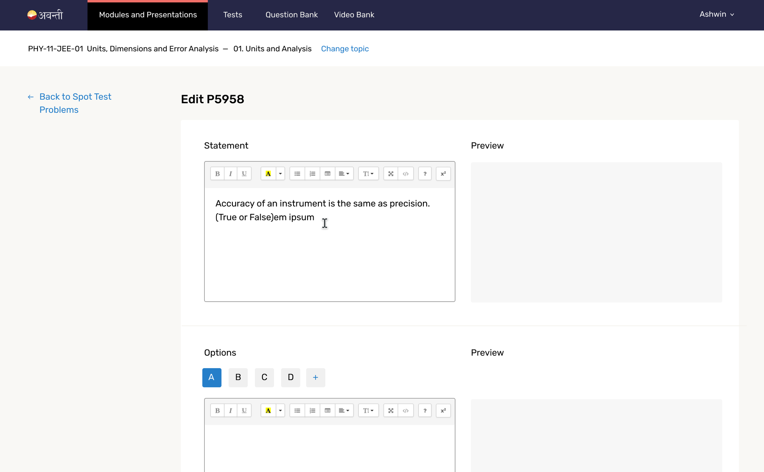
Each content item can be viewed and edited in a detail page.
Result
I conducted usability testing of the final design with 5 users and found that they were able to complete the navigation tasks with 100% success rate. The said that they were very pleased with the new design and found it much easier to navigate. They were able to find content without getting confused or lost at any step.
Also, this project inspired future ideas for this app which I explored while I was on this team.